UX/UI
Sustainability
AR
role
UX/UI Designer, UX Researcher
team
1 Project Manager
3 UX/UI Designer
Timeline
2 weeks
context
By 2023, Canadian institutions hosted nearly as many international students as the US, despite a far smaller population. I was one of those dreamers and landed at Cornerstone College, a vibrant institution with students from over 86 countries.
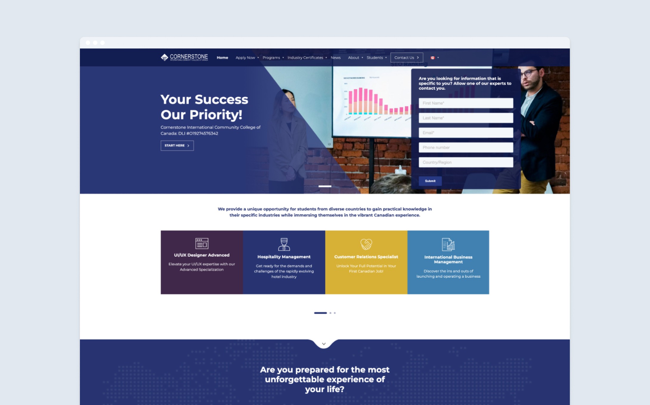
Current Cornerstone College website
But soon, I realized that, "Cornerstone College's website, a crucial touchpoint for prospective students, was failing to convey its true value."
problem space
We gathered 21 international students' responses via a questionnaire in Vancouver to understand students' experiences with the official website. We also conducted competitor analysis and heuristic evaluation to gather more usability issues.
Poorinformation architecture
Disorganized hierarchy and unclear content structure make it difficult for users to navigate and distinguish between program options.
Unclear navigation
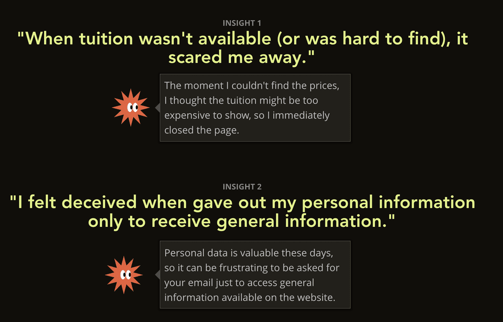
Critical information, like tuition fees, is buried in the footer, making it inaccessible and frustrating for users.
Weak content visibility
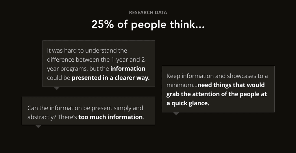
Excessive text overloads the website, hindering users from quickly scanning and finding key information.
Despite 40% of survey responses emphasizing the usability issues, students still chose to study here instead of dropping off the website.
This prompted the question:
What motivates them to apply to the school despite difficulties in finding important information?
To gather quick insights, I conducted guerrilla research with 5 students, uncovering why they applied and what they sought in their study experience.
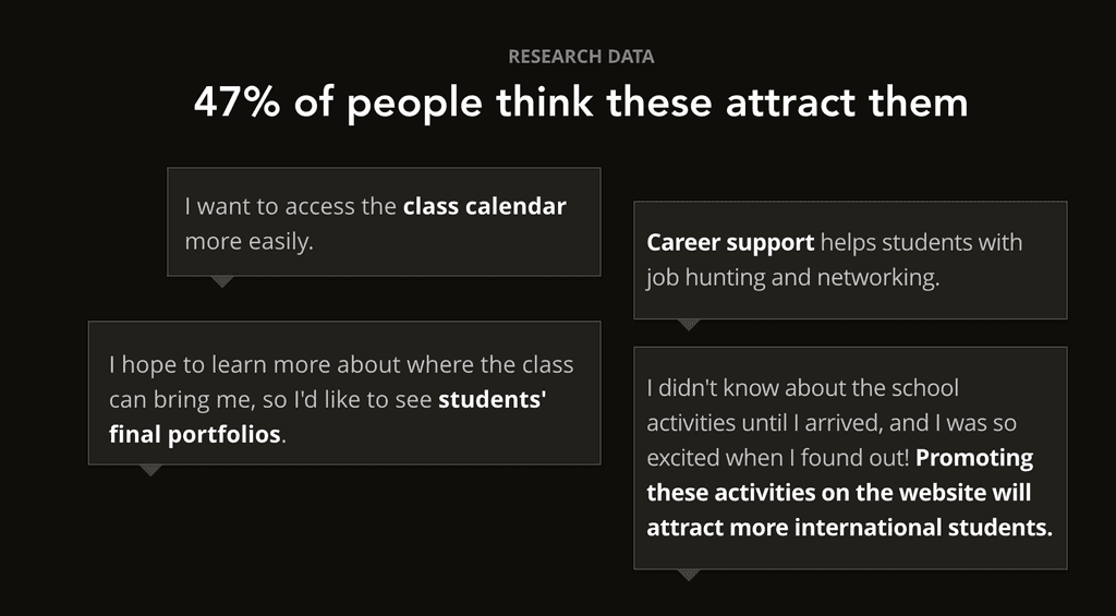
Students' expectations of their study experience vary based on their reasons for coming to Canada.
research summary

Persona 1
Goal
Study aboard
pain point
Can't find class materials on the website.

Persona 2
Goal
Work in Canada
pain point
Can't find information about the school's career support on the website.

Persona 3
Goal
Experience life in Canada
pain point
Wants to know more about the school's activities.
reframe the problem
This deeper insight led to the question, "How might we balance students' expectations with the college's business goals?"
Students' expectations
Study & work aboard
Enjoy life & make friends in Canada
College business goals
Build reputation
Maintain operation
focused path
With the how might we question in mind, we then started to define scope & MVP.
Define scope and MVP.
Given the limited timeframe, we aimed to maximize impact by focusing on the user flow: "how students discover and apply to their desired program."
Therefore, our MVP consists of redesigning navigation and 5 pages that represent the main user flow: Home page, Program page, UI/UX Design program page, Apply page, and About Us page.
north star principles
What it all guides to — the North Star principles.
information architecture problem
Start from clearing the clutter
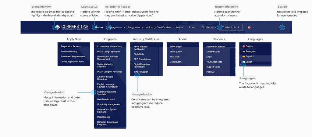
❌ Messy navigation structure.
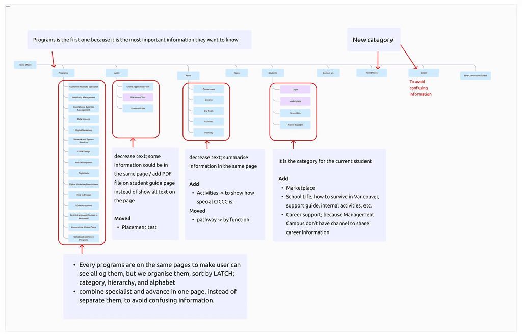
Based on the insights learned from the questionnaire and heuristic evaluation, we found the navigation making users difficult to find information.
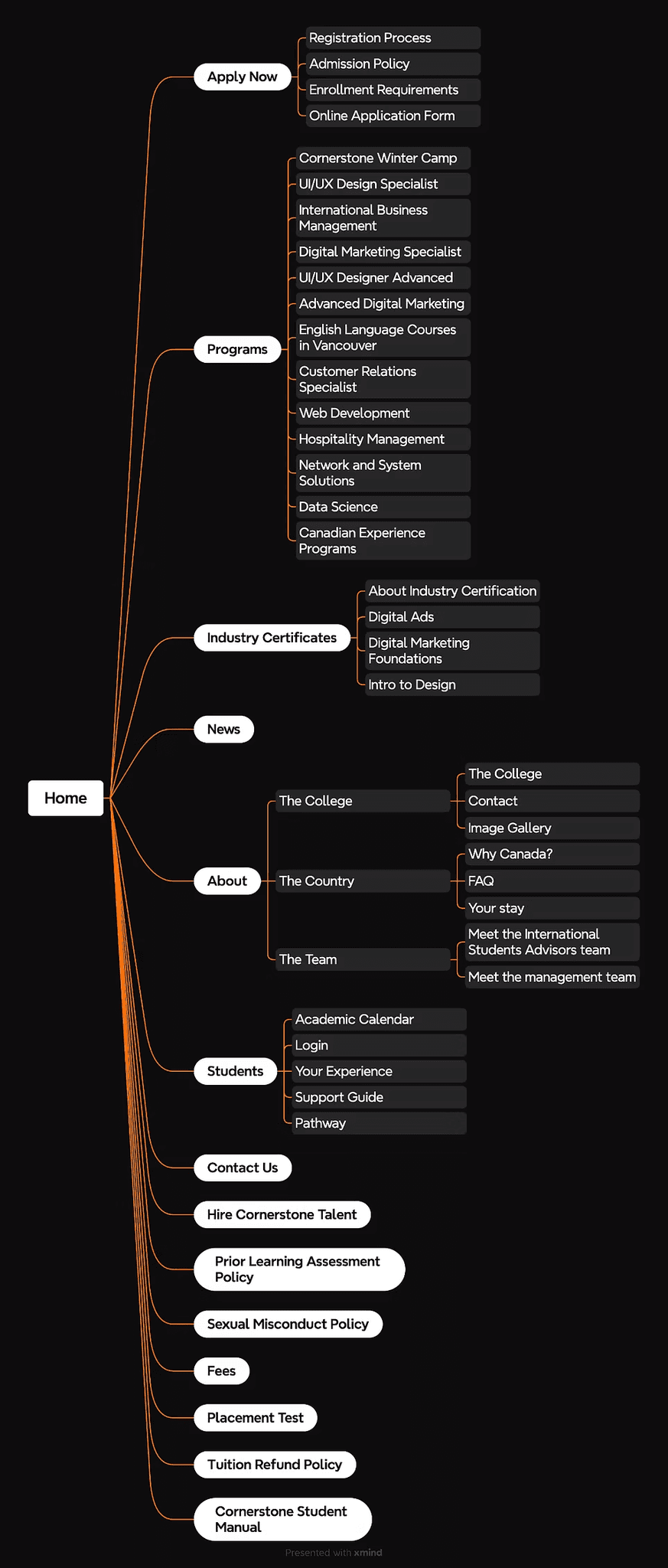
Collaborating with Chayanin Kosol and Miguel Valdes, we mapped out the sitemap and carefully audited the navigation structure and content organization.
❌ Confusing hierarchy & order.
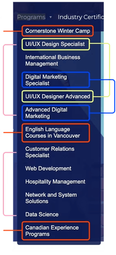
The dropdown items lack a clear categorization. Non-diplomas, diplomas, and advanced levels are mixed together without logical grouping.
The order of labels is neither alphabetical nor logically structured (e.g., based on type or level of the program).
The lack of separation between categories increases cognitive load, making it harder for users to scan and select a program.
Programs
Programs dropdown
Non-diploma
Diploma
Non-diploma
Non-diploma
Diploma
UI/UX Design
Specialist/Advanced
Digital Marketing
Specialist/Advanced
information architecture redesign
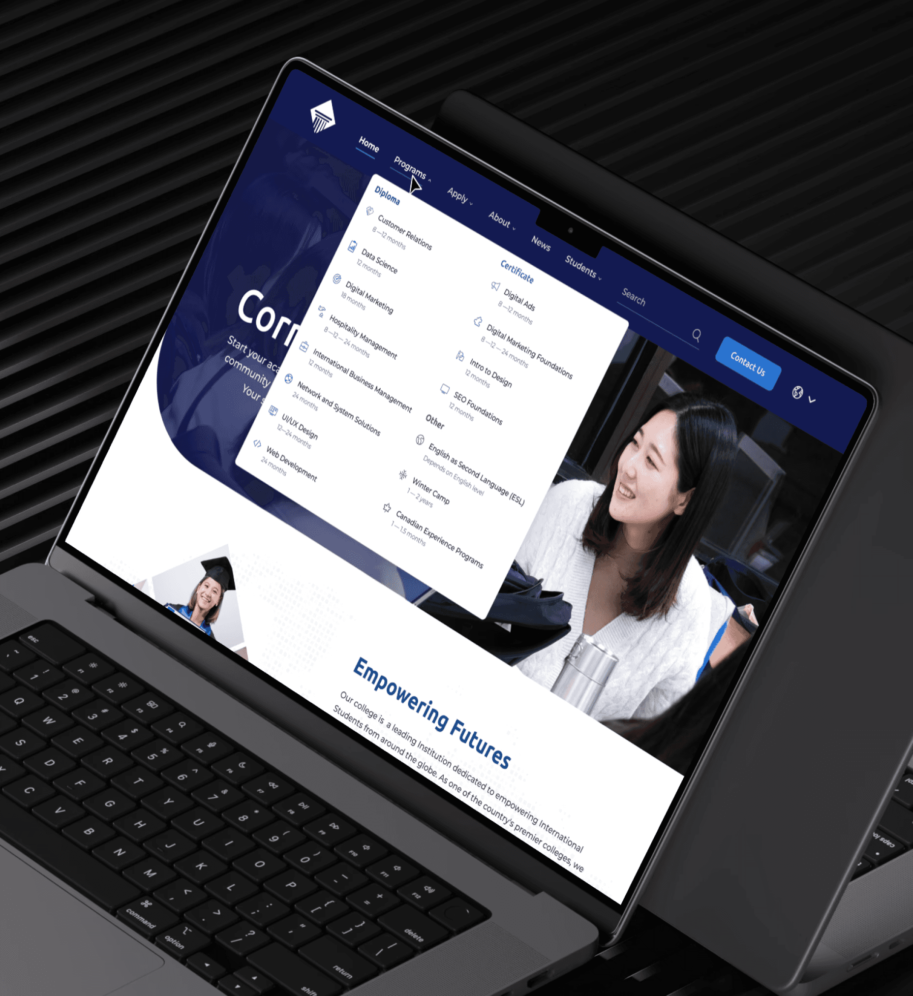
After — Clearer information architecture
After we mapped out the structural and visual navigation issues, we redesigned it to decrease users' cognitive load and make the information architecture clearer.
Decreased texts
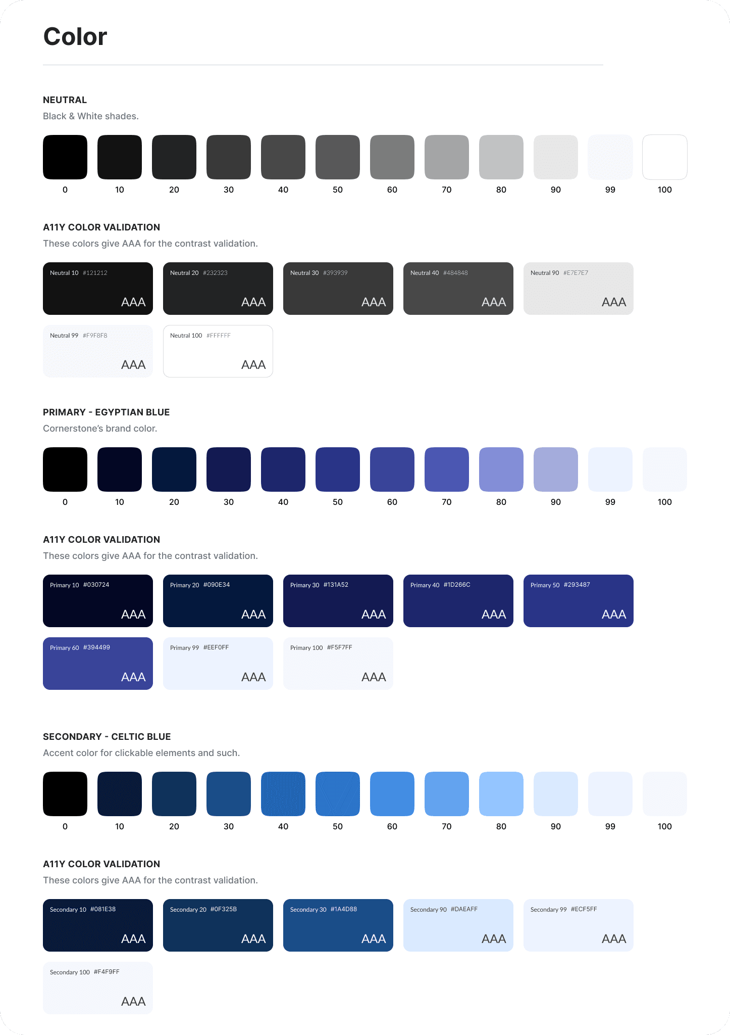
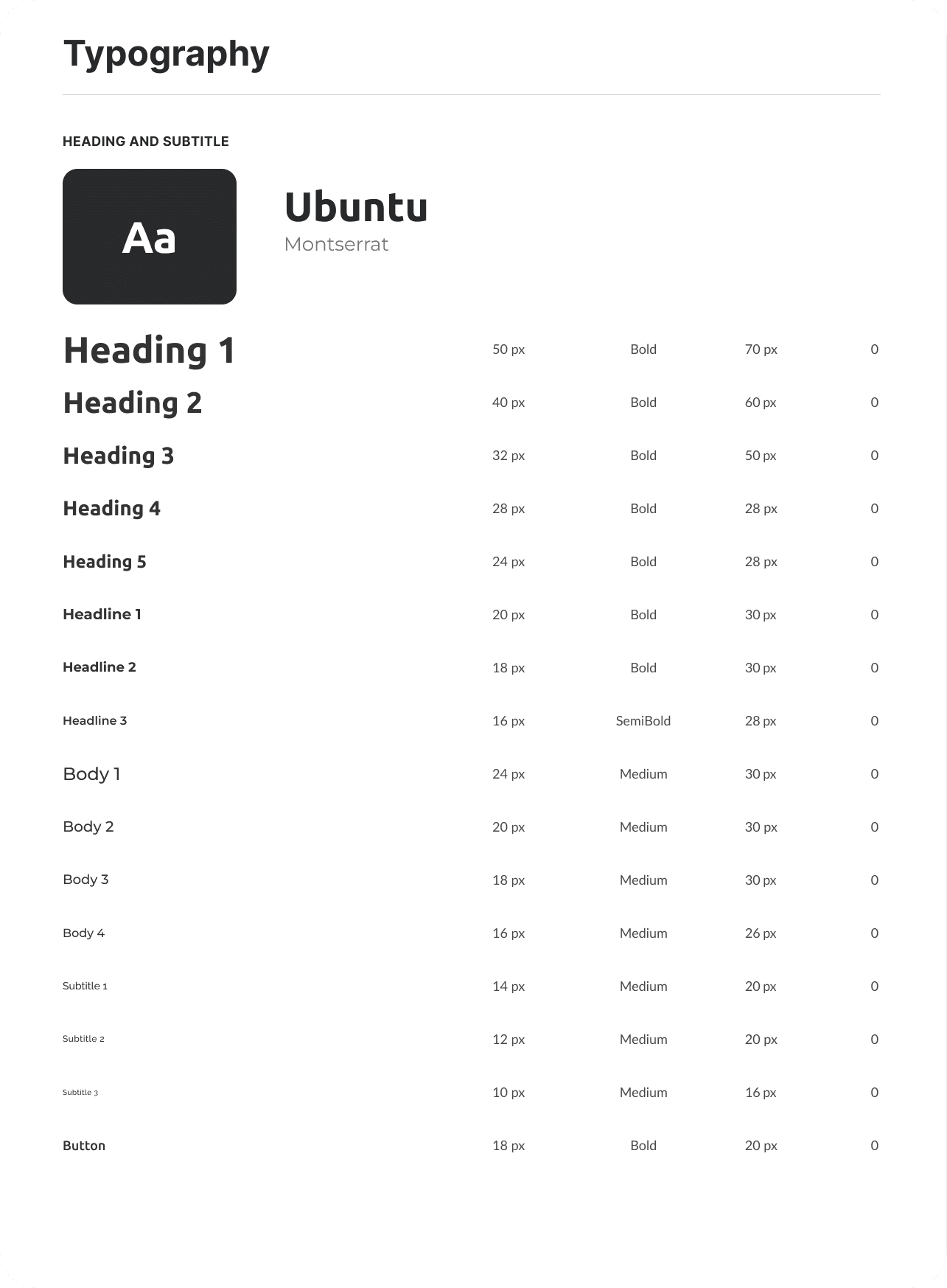
Clear labels
Added new categories
my design focus
Design One, Apply to All
Each team member was responsible for designing a specific page. I focused on the UI/UX Design program page, to create a template that could be applied to other program pages as well.
To begin, I conducted a thorough audit of each section of the existing page. Based on the insights gathered from our questionnaire, I made several iterations to enhance the design and usability. This iterative process ensured that the final design addressed the key issues identified by users and provided a cohesive, user-friendly experience.
solution 1
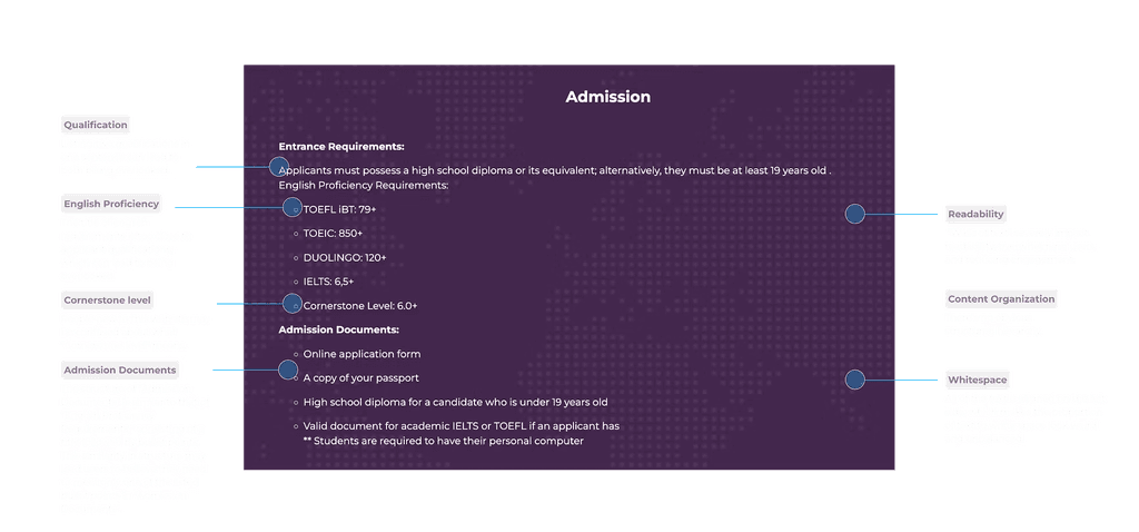
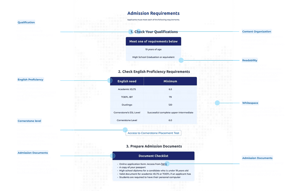
Tables break up text, making content less daunting and more glanceable.
Before
After
solution 2
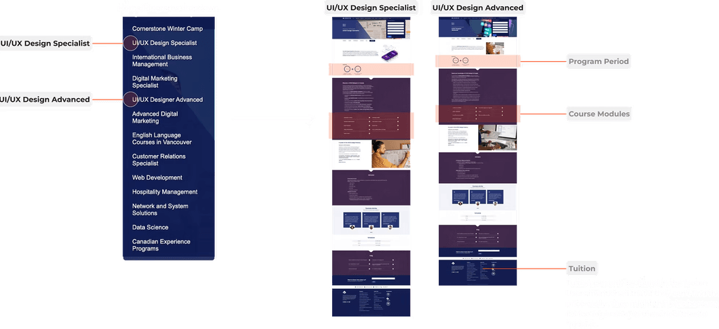
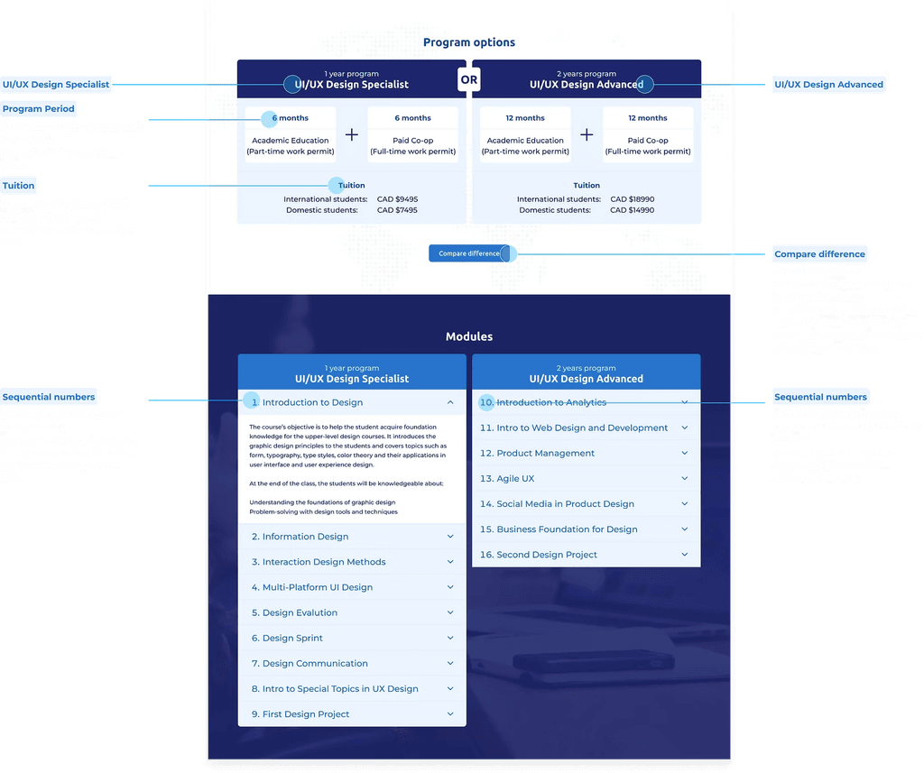
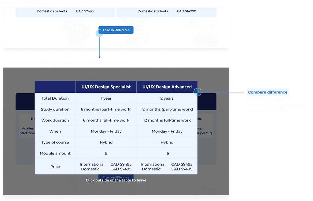
Combine the two similar programs(pages) into a single page to reduce confusion and offer a clearer comparison.
Confusing page labels.
Users struggle to differentiate between the two programs, requiring them to click into each page for details.
Upon review, they notice only two differences and are unable to locate tuition information on the program pages.
Before
After
prototype
design system
thank you ♡

